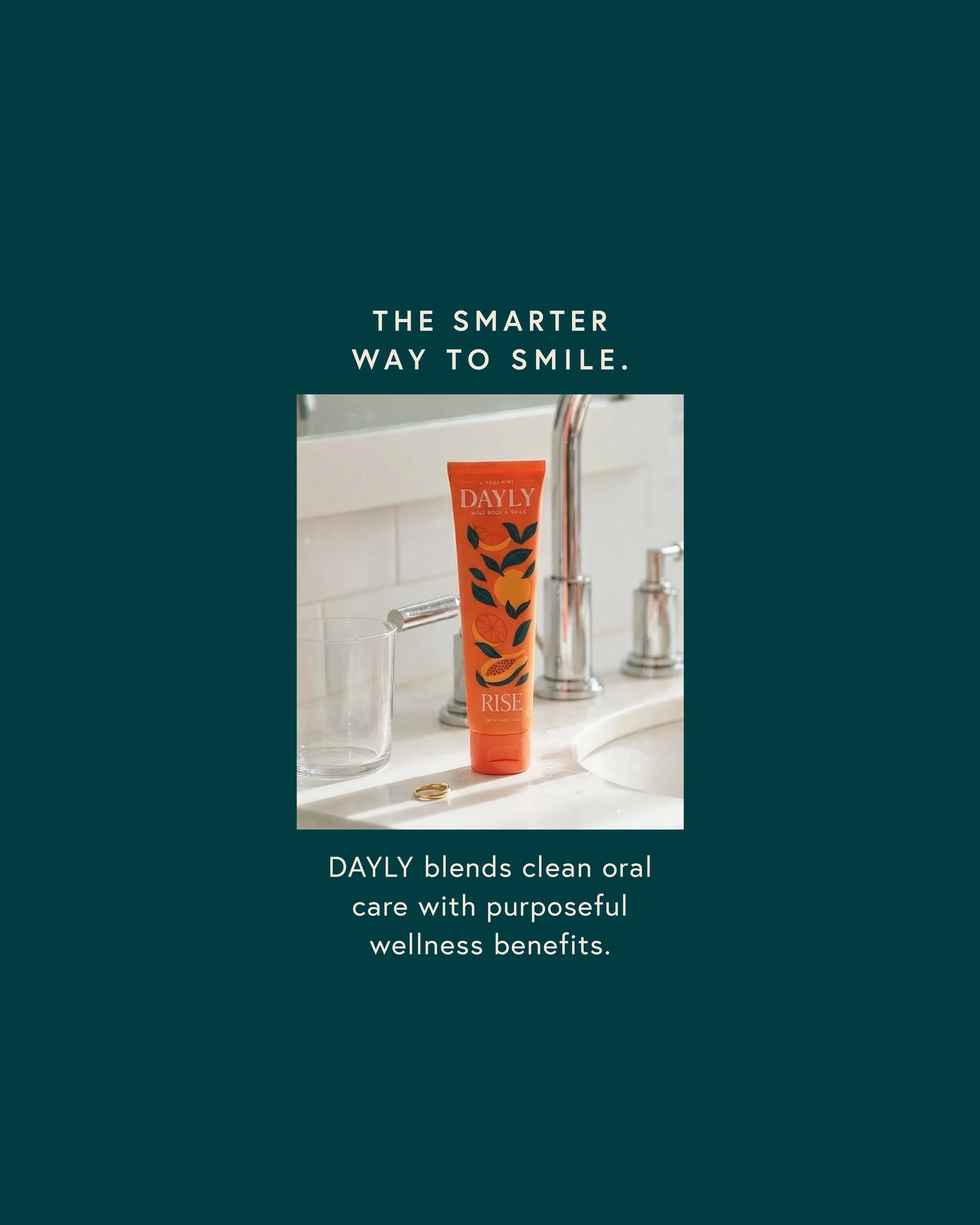
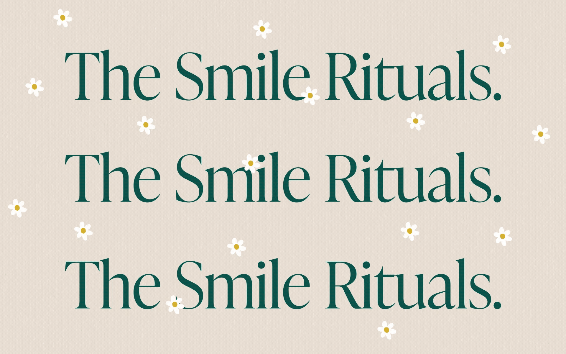
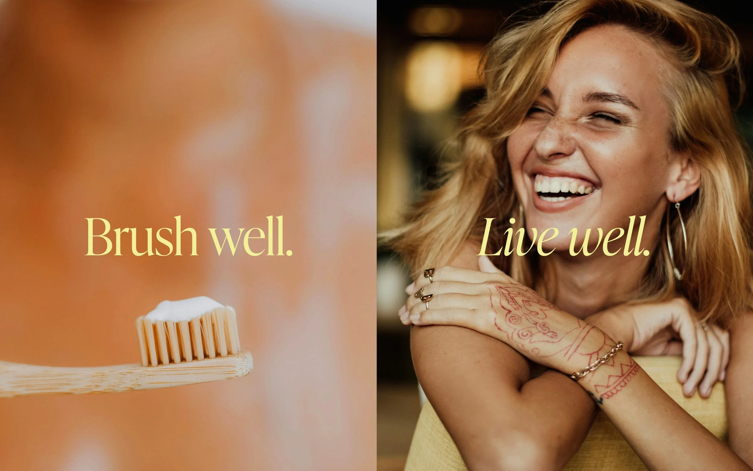
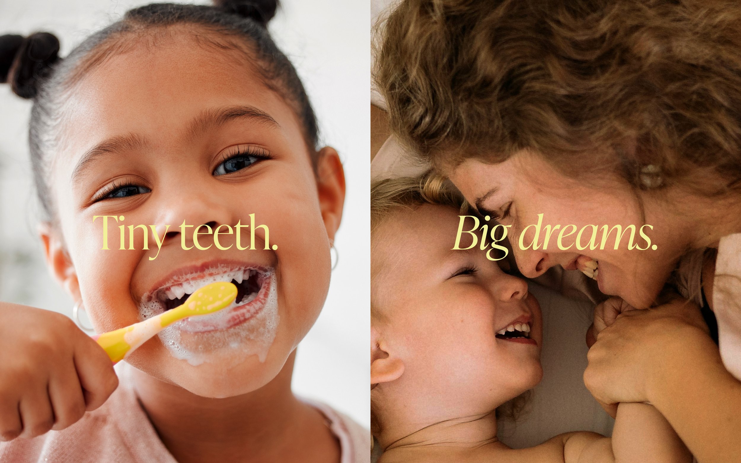
Brush Well. Live Well.
DAYLY is a first-of-its-kind vitamin-infused toothpaste system — designed for morning and night, for adults and kids, and for families who believe that taking care of yourself shouldn’t feel like a chore, but a ritual worth looking forward to.
Levie partnered with DAYLY to build the brand from the ground up, crafting a bespoke visual identity, nature-inspired illustration system, and joyful packaging designed to carry this vision into the world. Together, we set out to create something the oral care aisle had never seen: a brand as beautiful as it is functional — with a visual language expressive enough to spark a new category, and a presence designed to live on your counter, not hide under it.
-
+ Visual Identity
+ Concept Development
+ Brand Story & Messaging Development
+ Illustration System
+ Color System
+ Typographic System
+ Brand Guidelines
+ SKU Packaging Design
+ PR Box & Gift Set Packaging
+ Retailer-Ready Files
+ Deck Design & Digital Collateral
The Challenge.
Oral care is a sea of sameness. Minty. White. Promise-heavy. And almost entirely focused on what it prevents rather than how it makes you feel. For decades, the category has spoken the language of dentistry: clinical, cautious, and largely forgettable.
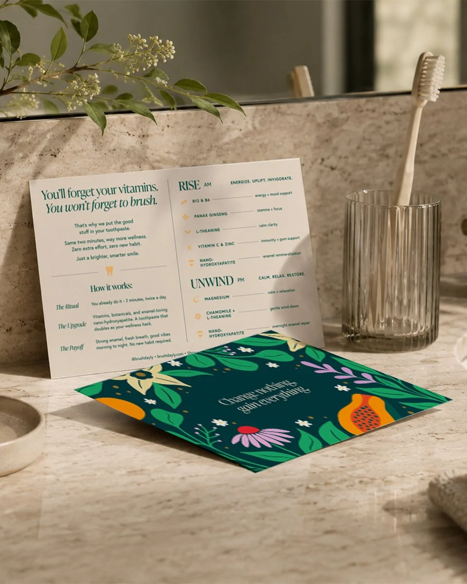
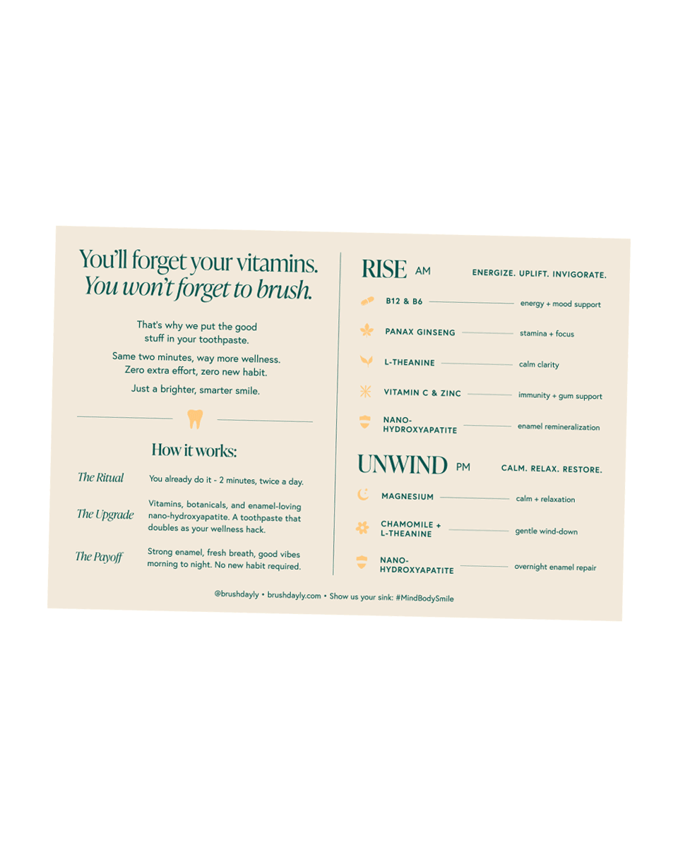
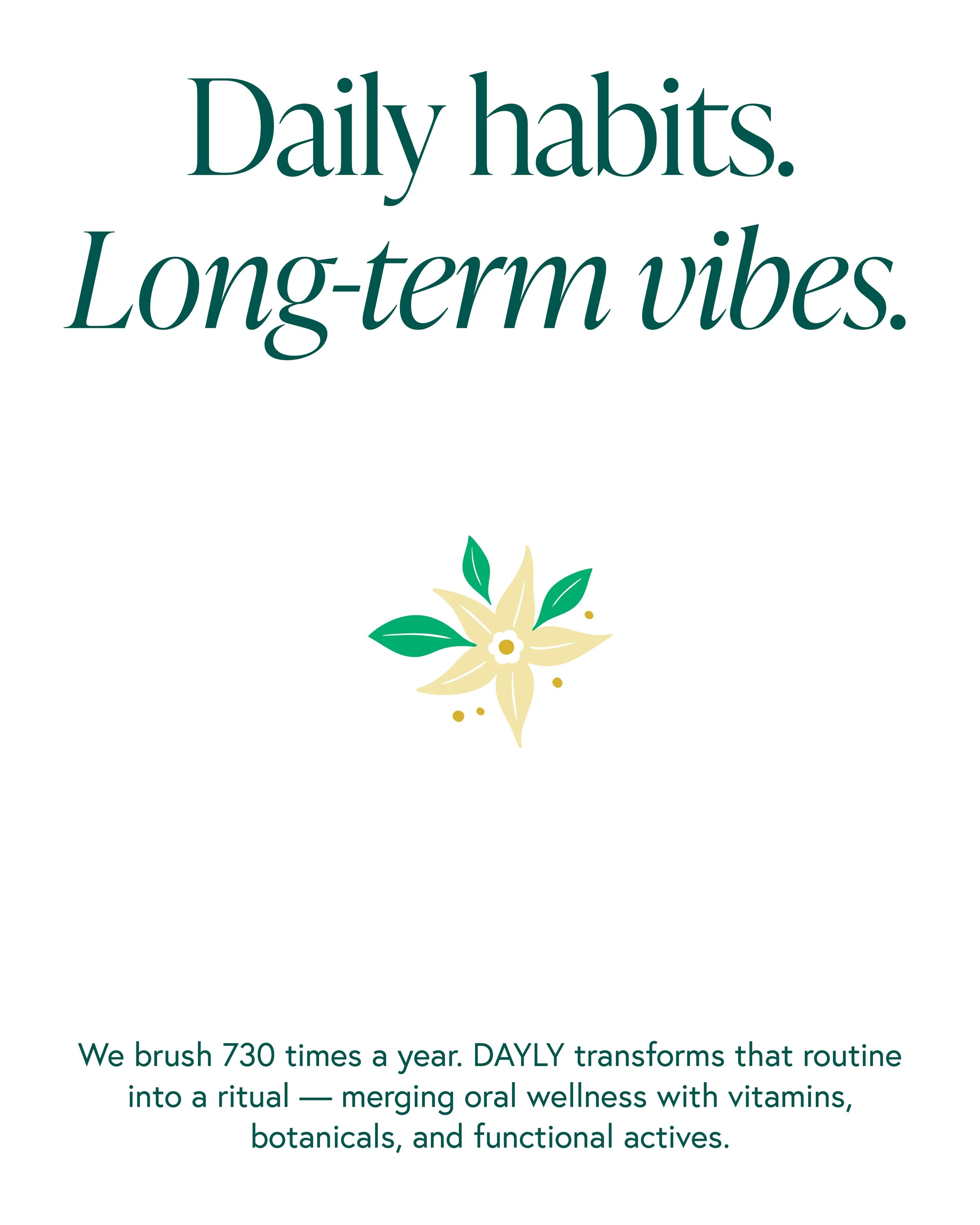
But something much bigger was being overlooked: the sink is where compliance already lives. It’s one of the most consistent, near-universal habits in existence. And yet no brand had ever treated those two minutes, morning and night, as distinct moments with distinct needs, benefits, and a reason to look forward to them.
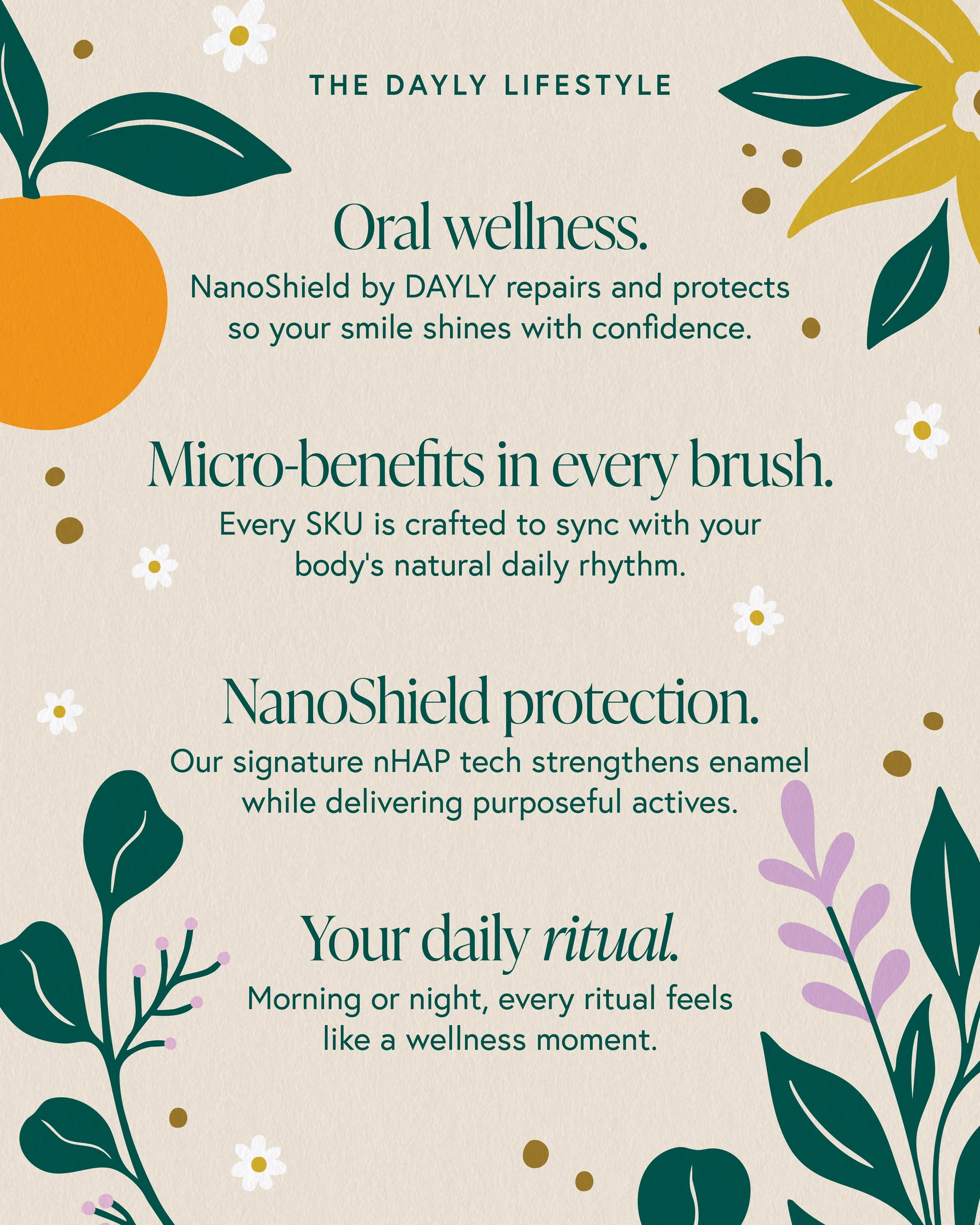
That was the unlock. Consumers don’t want wellness added to their routine; they want it built in. DAYLY’s formulation: NanoHydroxyapatite for enamel repair, and botanicals and vitamins mapped specifically to AM and PM benefits, made a true ritual system possible. The challenge was building a brand identity and packaging system beautiful enough to earn shelf and counter space, and clear enough to make the whole family fall in love with it.

Our Approach.
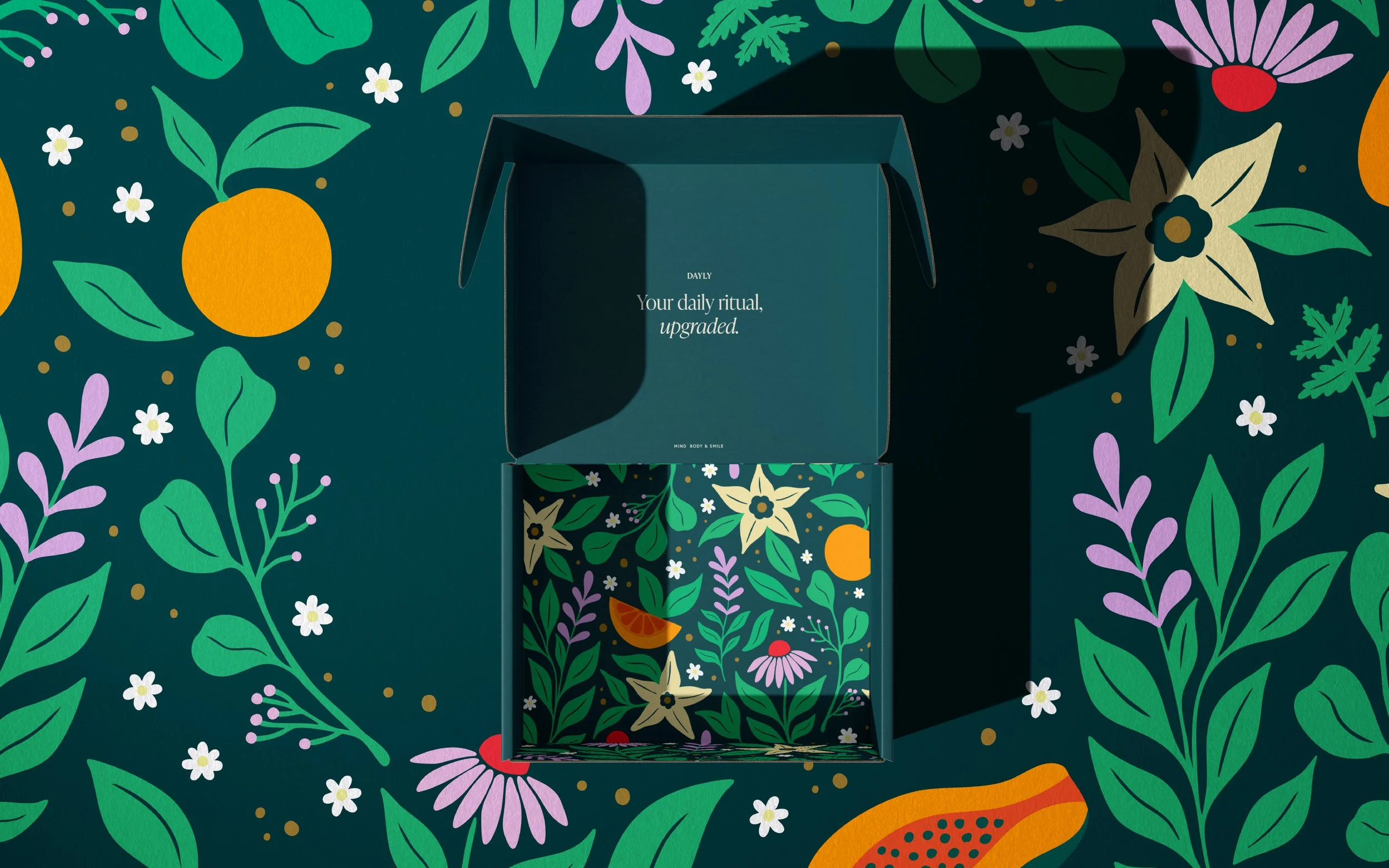
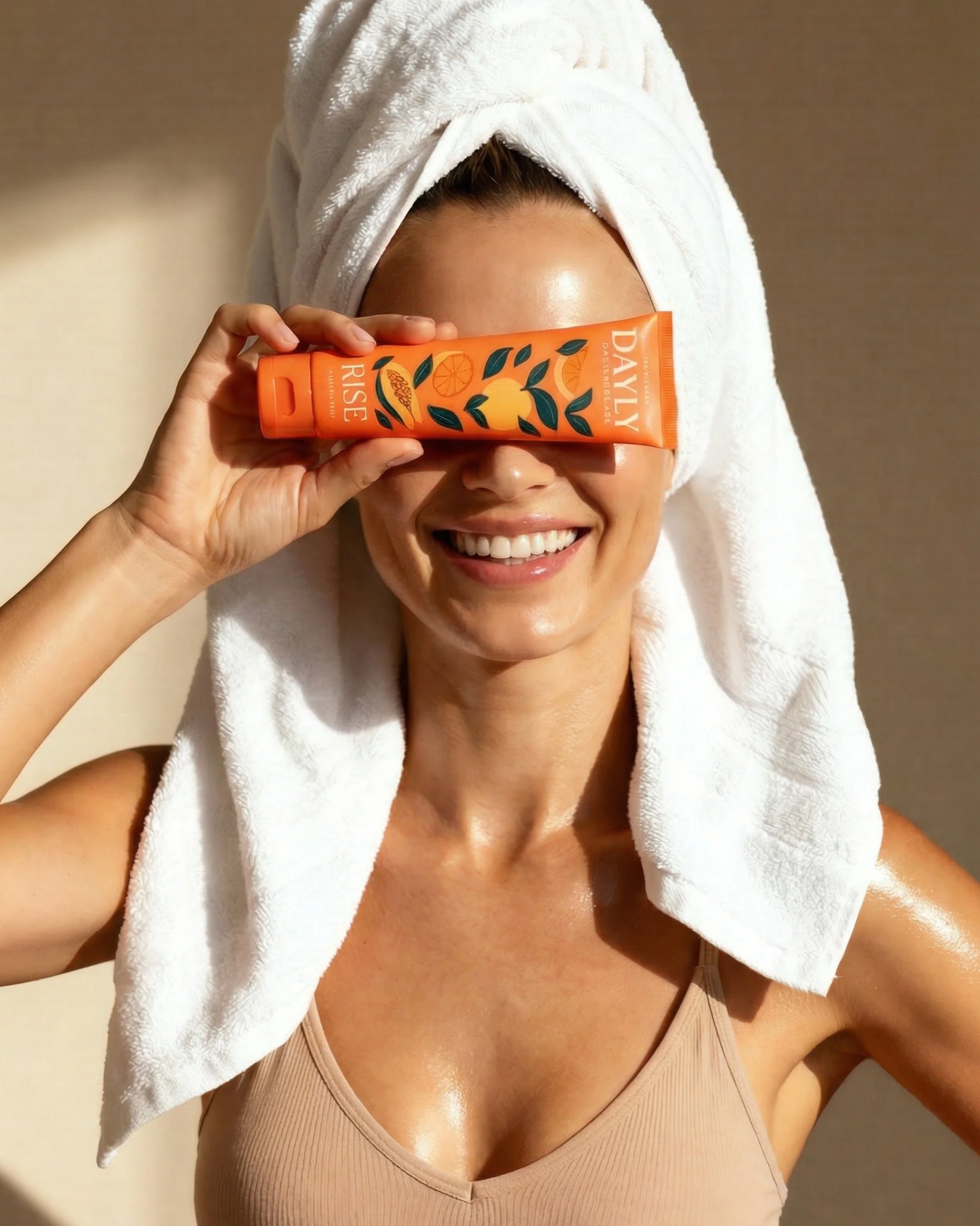
From the very first conversation, one idea guided everything: DAYLY should be a product people want to leave out, not put away.
We call this Lifestyling the Home, the belief that great consumer design doesn’t just function well, it becomes part of the way a space looks and feels. For DAYLY, this wasn’t just a design principle; it was the entire brand strategy.
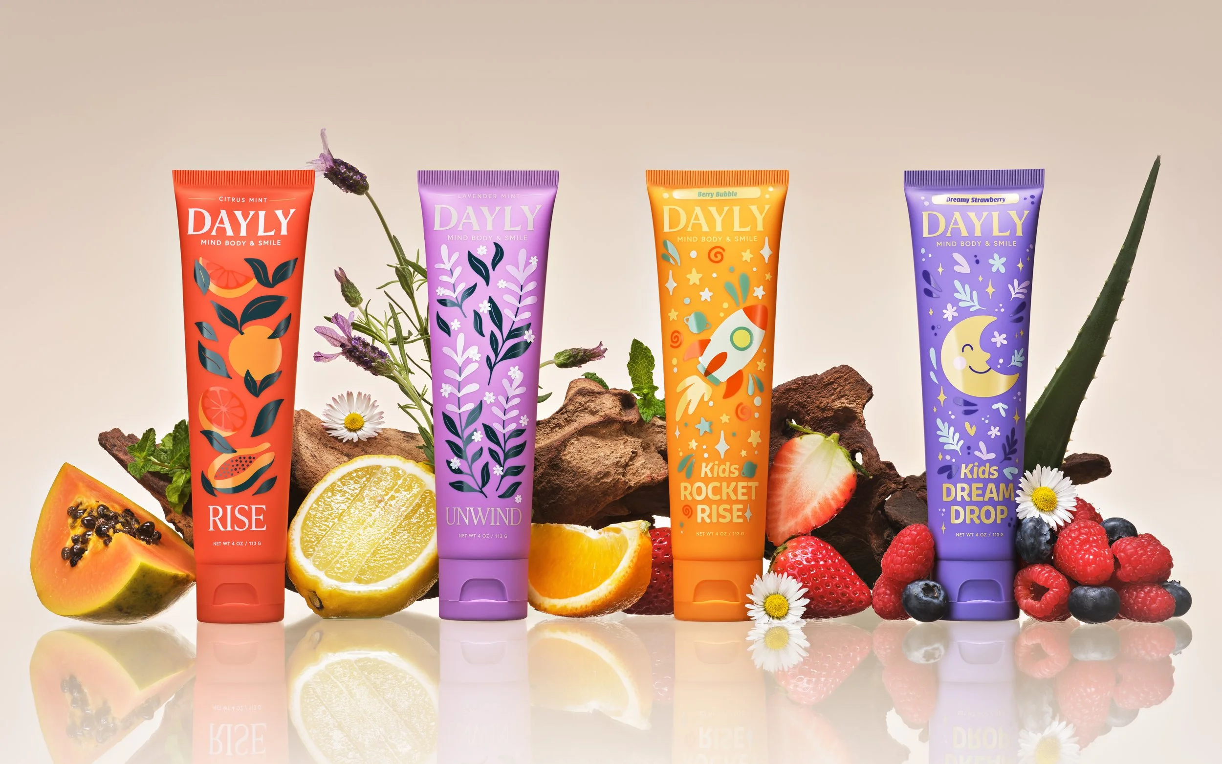
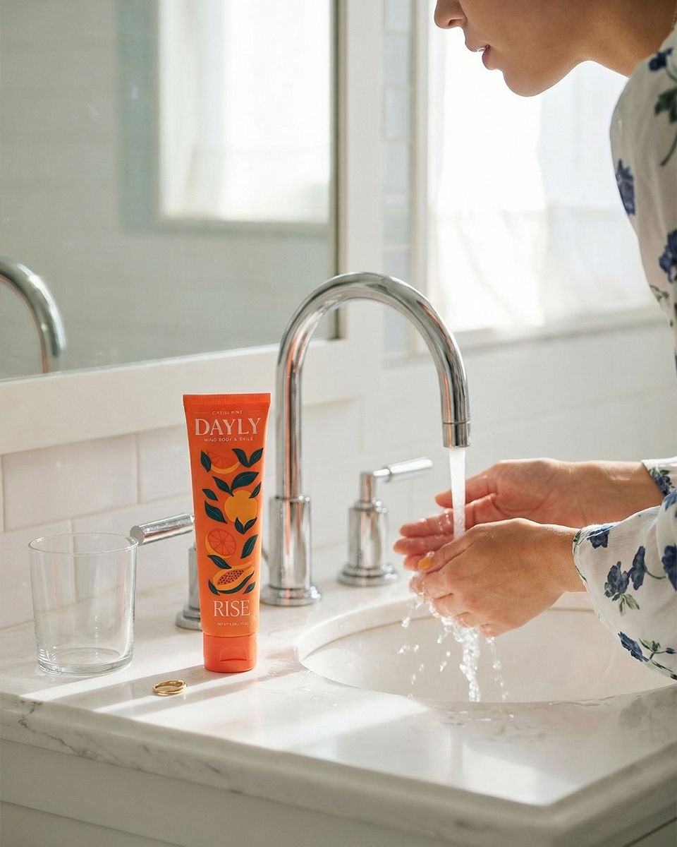
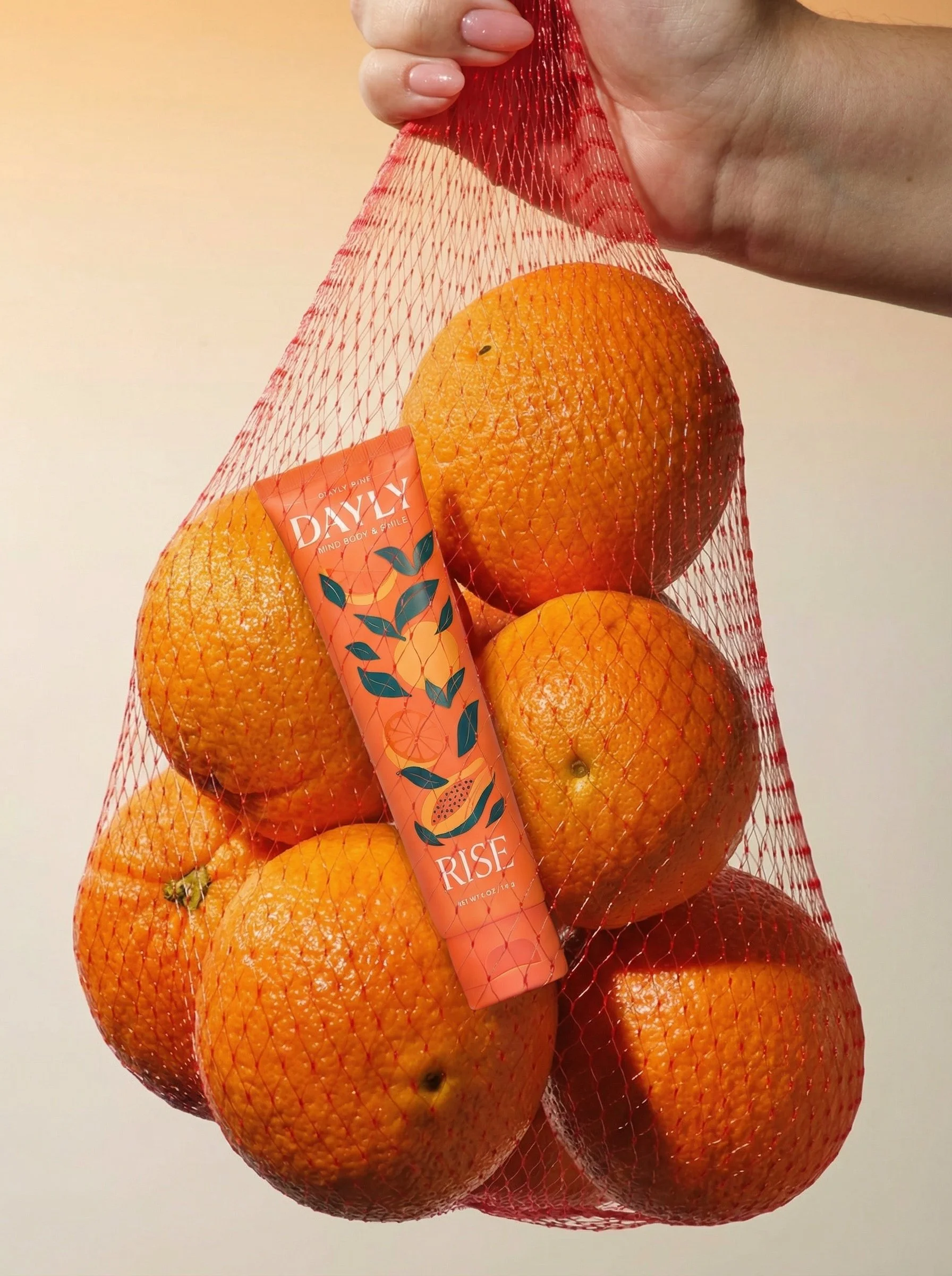
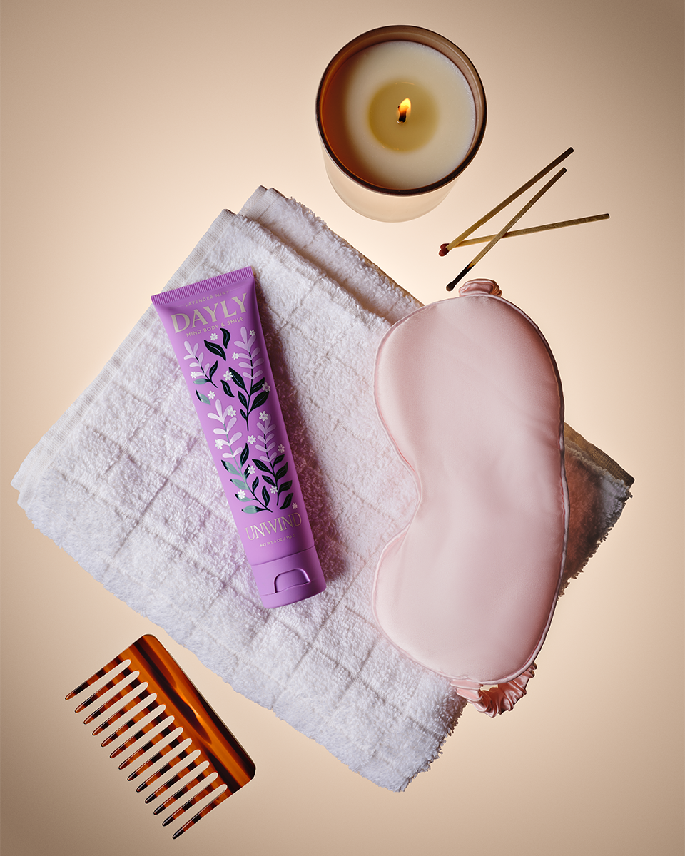
To bring it to life, we built a visual world rooted in nature; lush, botanical, and full of warmth. A bespoke illustration system gives the brand its own visual vocabulary, anchored by a palette of deep teal, bright green, and warm cream, with accent colors derived from each SKU’s flavor profile and daypart.
A refined serif establishes editorial intention at the headline level while a clean sans carries ingredient details with clarity and ease. The result is packaging that communicates everything it needs to at a glance, without sacrificing an ounce of visual appeal.
The biggest challenge was hierarchy: packaging that’s stunning enough to earn counter space and clear enough to communicate benefits, ingredients, and moment of use at a single glance for audiences ranging from toddlers to adults. The result is a system that works just as hard as the products inside it.
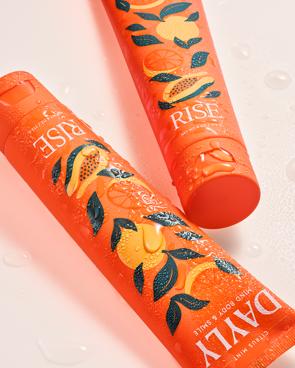
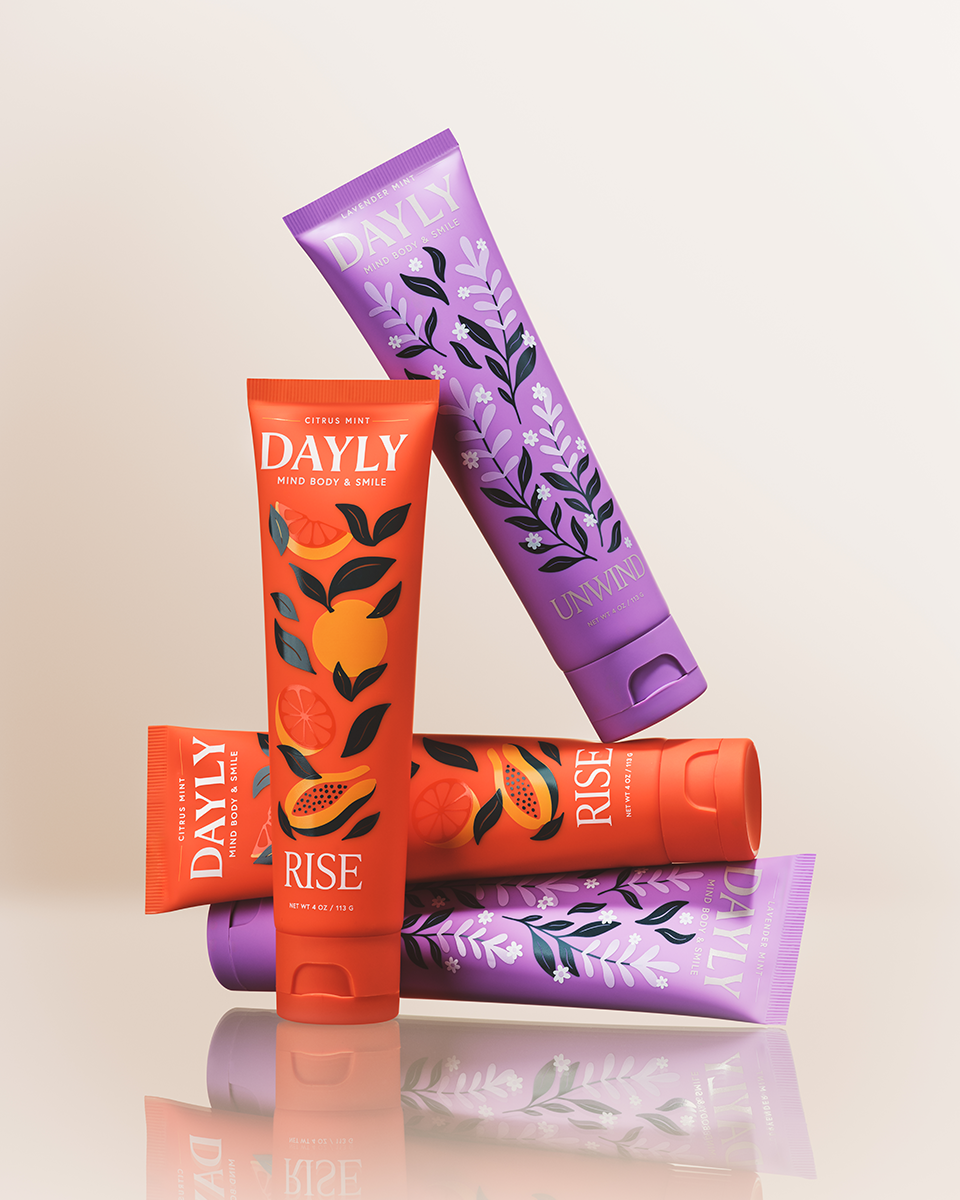
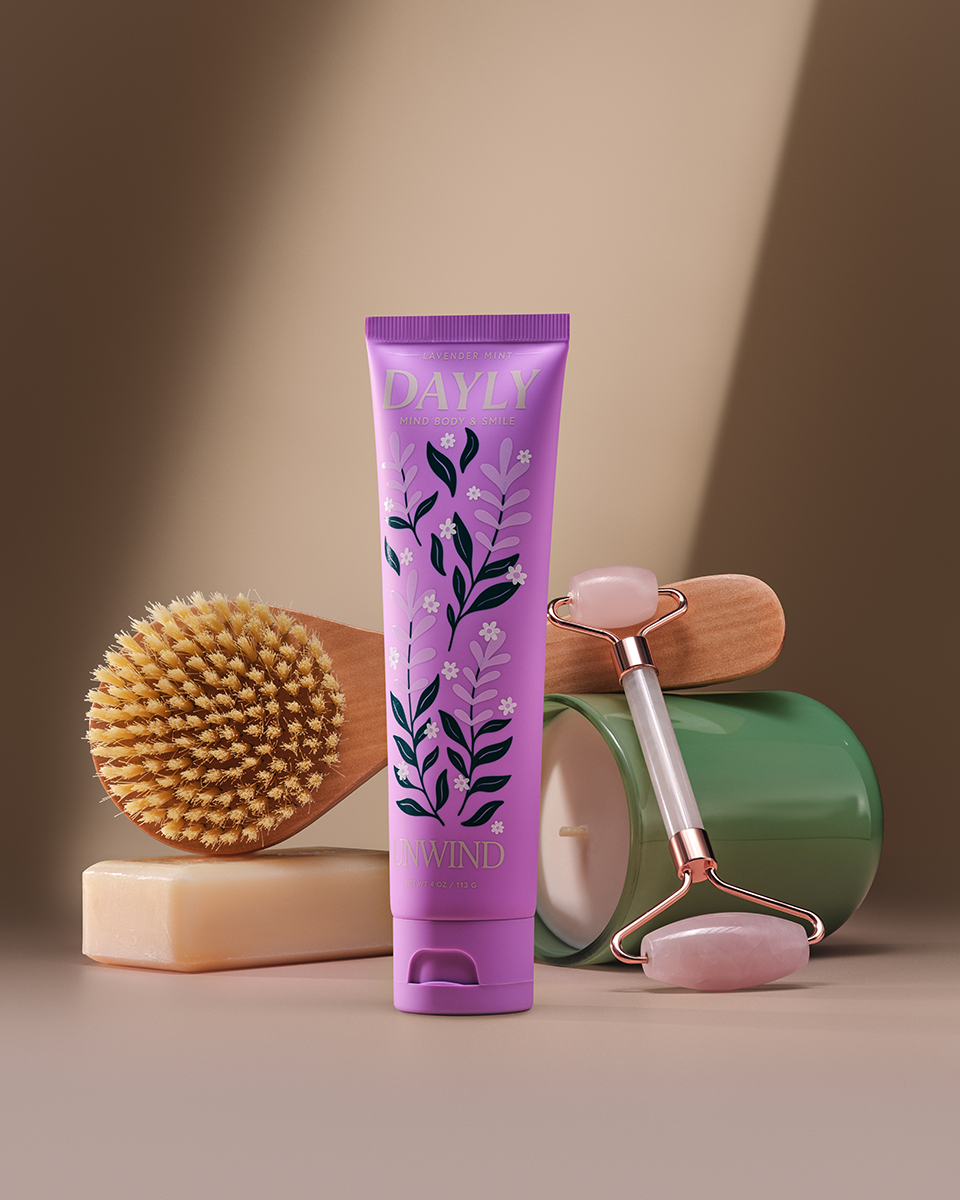
The OG Line.
The adult line was designed to feel like a premium wellness object, the kind of thing you’d expect to find on a beautifully curated bathroom shelf, not buried in a cabinet. Two formulations, two distinct moments: RISE for the morning, UNWIND for the night time.
Typography leads with a refined, thin serif for the product name, and hero hierarchy; feminine, editorial, and quietly luxurious. A clean sans carries the supporting details. Together they create a visual voice that’s as confident as the formulas themselves.
Color does the heavy lifting in differentiating the two SKUs while keeping the line coherent. Each accent color was drawn from the formulation’s flavor profile and daypart; energizing and bright for the morning, warm and restorative for the evening. Anchored always by the brand’s deep teal, green, and cream. The packaging is designed to live together on a counter and look intentional doing it.
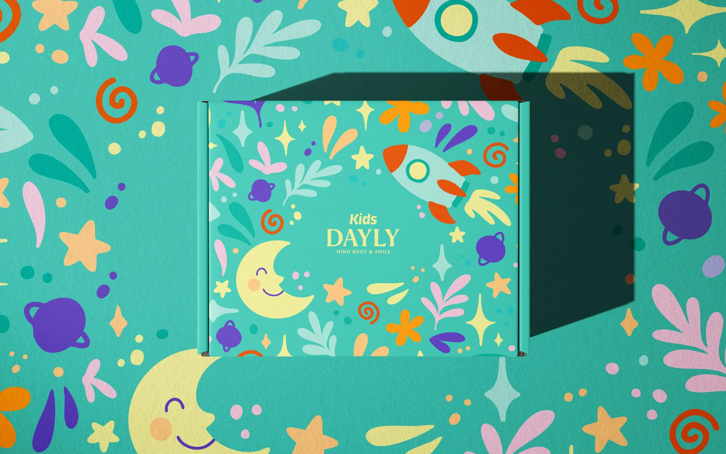
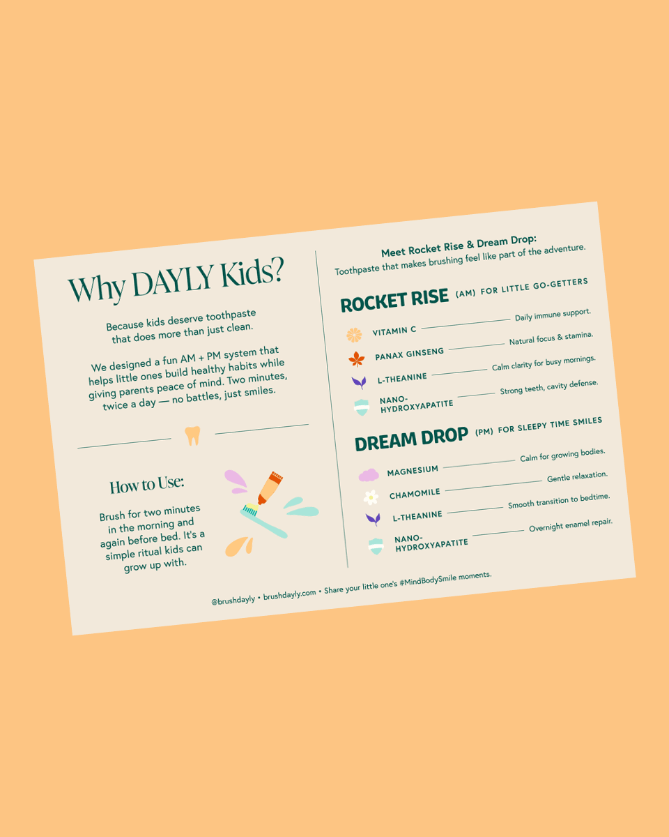
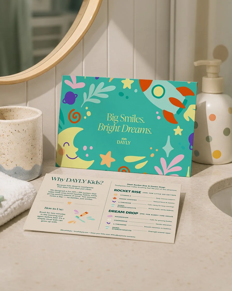
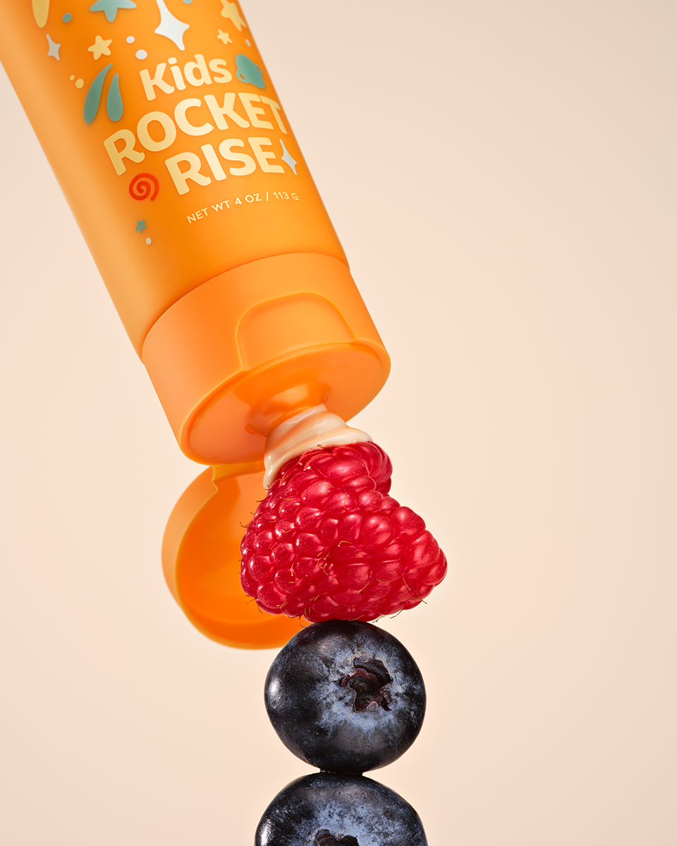
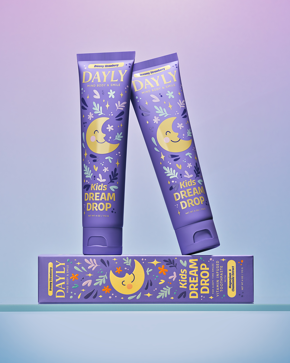
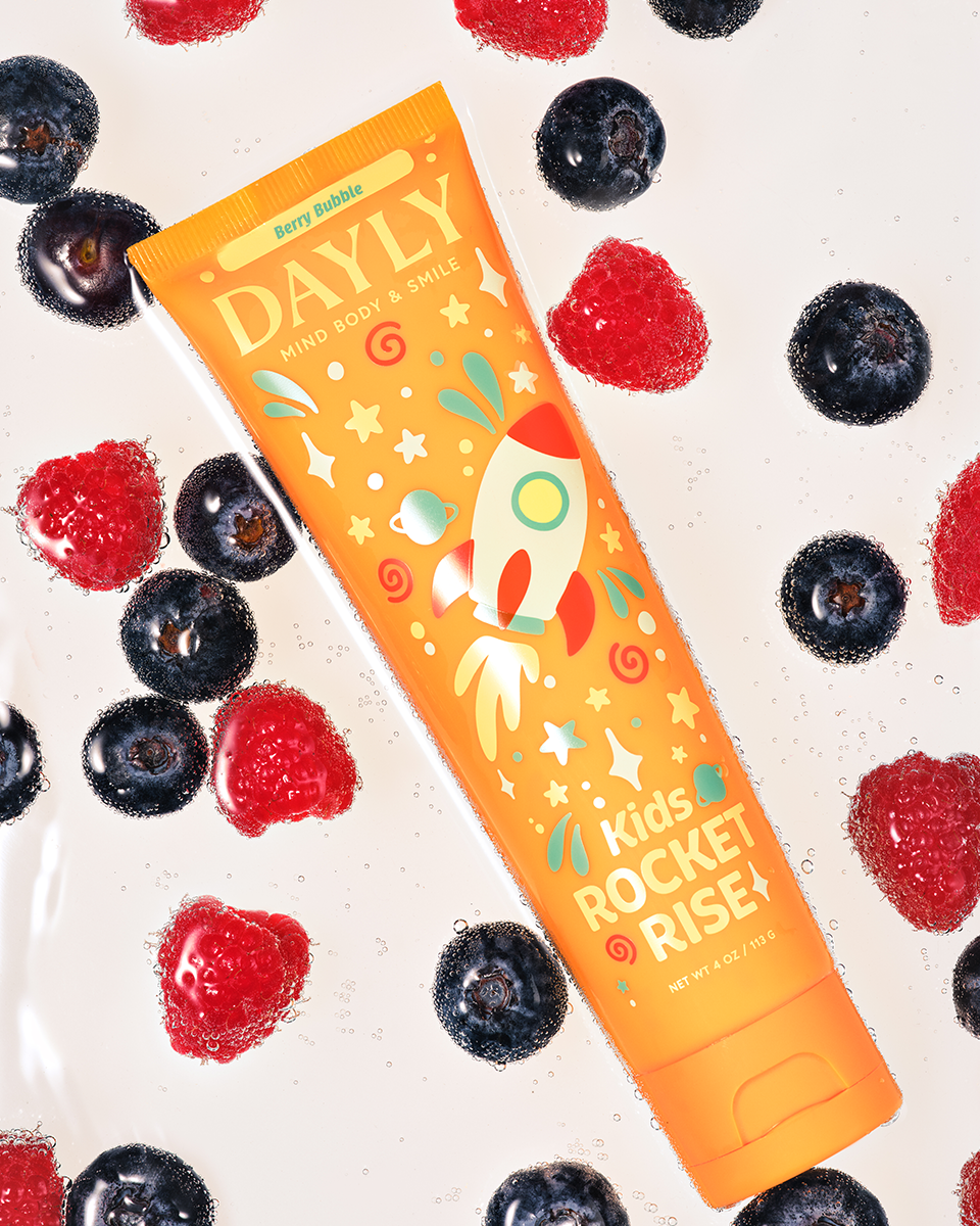
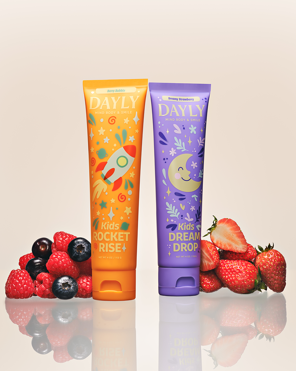
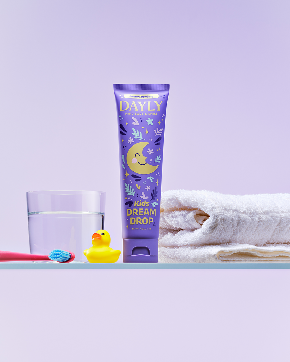
The Kids Lineup.
The kids’ line asked a different question: how do you design something parents feel proud to buy and kids genuinely get excited about without making it feel like a different brand?
The answer was in the illustration system. The same style, stroke, and nature-inspired language that defines the adult line carries into the kids’ SKUs, but with a bolder, more playful and funky energy. Characters and compositions feel joyful and approachable without tipping into loud or cartoonish.
Typography shifts accordingly. A chunky, rounded sans replaces the thin serif for product names, giving each SKU a friendly, kid-approved personality. The rest of the typographic system stays consistent with the family identity, so the line reads as a cohesive whole whether the full range is on shelf together or split between bathroom and kids’ bath.
The Outcome.
DAYLY arrived in the world looking unlike anything else in the oral care aisle — and that was exactly the point. The brand carries the warmth of a wellness ritual and the confidence of a category-defining product, with a visual presence that feels as considered on a bathroom counter as it does on a retail shelf.
What this project affirmed is something we believe deeply at Levie: when design is rooted in how people actually live — their habits, their homes, their families — it stops being decoration and starts being behavior change. DAYLY doesn’t ask people to do something new. It makes the thing they already do feel worth celebrating.
Because when design earns a place on the counter, it earns a place in the ritual.