

Better care starts with Kiwi.
Kiwi believes healthcare shouldn’t be complicated — or out of reach. They’re on a mission to make it fair, easy, and accessible for everyone, no stress, no waiting around. Through smart financial solutions and flexible payment options, Kiwi ensures patients get the care they need, when they need it — helping to strengthen communities and build a healthier future across Latin America.
To bring Kiwi’s vision to life, Levie teamed up with them to shape a brand identity that feels like a breath of fresh air — warm, welcoming, and real. Together, we crafted a visual world that speaks directly to Latin American families in a way that's friendly, vibrant, and genuinely reassuring.
The goal? To create a brand that feels as clever and caring as Kiwi’s solutions, like the trusted friend who's always there to help you through.
-
+ Brand & Positioning Strategy
+ Concept Development
+ Visual Identity Design
+ Wordmark & Logo Design
+ Identity System Design
+ Illustration System
+ Color Palette
+ Typographic System
+ Brand Story
+ Tagline & Messaging Development
+ Brand Guidelines
+ UI/UX App Guidelines
+ Deck Design
+ Corporate Comms Templates
+ Landing Page Design
+ Implementation Advisory
The Challenge.
LatAm’s income inequality has created serious hurdles for customers to find access to healthcare services, from dentistry to surgeries and more.
Kiwi’s brand challenge centered on introducing more innovative healthcare financing solutions. We set out to create a brand that felt human, approachable, and genuinely empowering — stripping away the layers of bureaucracy, cutting through confusion, and replacing intimidation with approachable education and trust.
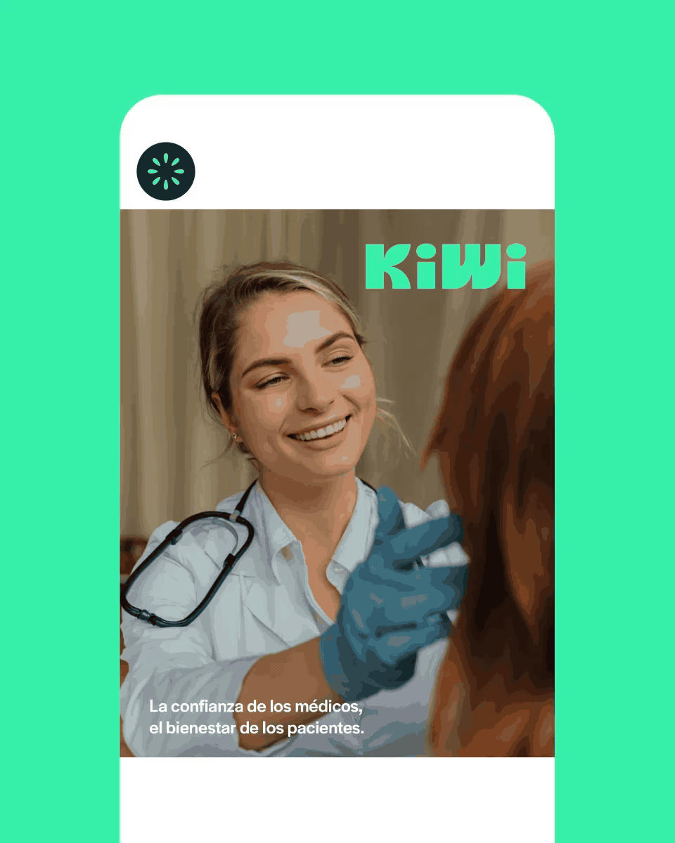
Our goal was to bring that spirit to life, making the experience feel refreshing, supportive, and full of optimism. The new identity needed to spark joy, ease, and a real sense of possibility. Through bold colors, warm, welcoming typography, playful illustration, and natural, relatable photography, we captured Kiwi’s positive, people-first approach to healthcare — showing that taking care of yourself can feel simple, uplifting, and even joyful.


Our Approach.
We set out to build a design philosophy that felt as authentic and vibrant as the brand itself — what we called the “Peruvian Kiwi Philosophy.” Inspired by Kiwi’s roots and namesake, we explored the qualities of the fruit and how they connect to the brand’s ethos and heritage. We identified characteristics like bright, fuzzy, smooth, and acidic — traits that became the building blocks for a visual language that’s both distinctive and ownable.
The custom color palette draws from the rich variety of kiwi fruit tones, infused with a nod to Peruvian Chicha culture.
At the heart of the brand, we crafted a custom hand-drawn wordmark — a bold yet fluid signature that captures Kiwi’s warm, confident personality. We also introduced a playful illustration system to bring the brand to life beyond words. Characters like the Kiwi Coin, Dr. Kiwi, and a full cast of relatable personas make interactions fun, clear, and human.
Whether supporting a first-time user taking that first step toward care, or empowering physicians to better serve their patients, Kiwi stays true to its purpose: making healthcare feel simple, supportive, and right within reach.


The Outcome.
Kiwi’s new identity feels warm, relatable, and refreshingly simple, just like the healthcare experience they deliver. Through bold colors inspired by cultural cues, smooth and friendly typography, playful illustrations, and human-centered photography, every element invites trust and sparks joy. From first-time users seeking care to physicians guiding patients, the brand now delivers an experience that is intuitive, supportive, and empowering.
Kiwi’s refreshed look not only reflects its mission to make healthcare more accessible — it positions them as a trusted partner and caring presence for communities across Latin America and beyond.


