Better Wellness for the Next generation of Mamas.
UpSpring has always been more than just a health brand; they’re the cheerleader in every woman’s corner, offering natural, solutions-driven formulations for every part of the maternity journey. Whether it’s pre-natal prep, post-partum care, or finding balance in everyday wellness, upSpring makes sure that women are supported, celebrated, and nurtured.
Levie partnered with upSpring to reinvigorate their brand positioning and redesign their packaging, creating an identity as dynamic and vibrant as the women they serve. Together, we set out to give the brand a modern voice and a powerful visual punch that speaks to a new generation of mamas—confident, empowered, and unapologetically bold.
-
+ Brand Strategy
+ Concept Development
+ Brand Evolution
+ Brand Story & Messaging Development
+ Illustration System
+ Color System
+ Typographic System
+ Brand Guidelines
+ SKU Packaging Design
+ Campaign Design
+ Deck Design & Digital Collateral
The Challenge.
For almost two decades, upSpring has proudly supported mothers through one of life's most transformative journeys: from carrying and feeding their little ones to finding time to nurture themselves. But now, upSpring was ready to turn the page to a new chapter, one that speaks to all women who seek to live happier, healthier lives—not just those with little ones on the way. They wanted to step out from being seen solely as a "mama brand" and step into the spotlight as a holistic wellness partner, one that feels like a trusted friend on a mission to support and uplift every woman, at every stage.
This shift brought an exciting challenge: reimagining the brand and packaging to resonate with the modern woman—confident, vibrant, and unapologetically in charge of her health. The new identity needed to spark joy, stand out on the shelf, and stay true to UpSpring’s nurturing roots while embracing a fresh, expressive, and empowering voice. Through bold aesthetics, dynamic energy, and authentic storytelling, we set out to create a brand experience that instantly connects and inspires.


Our Approach.
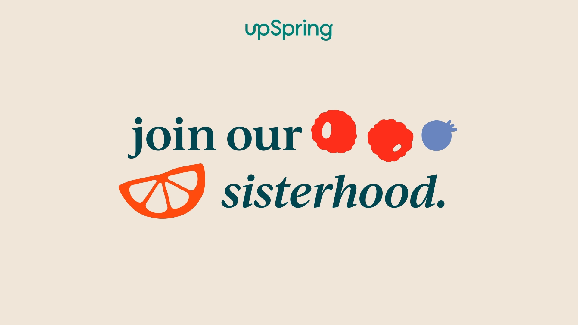
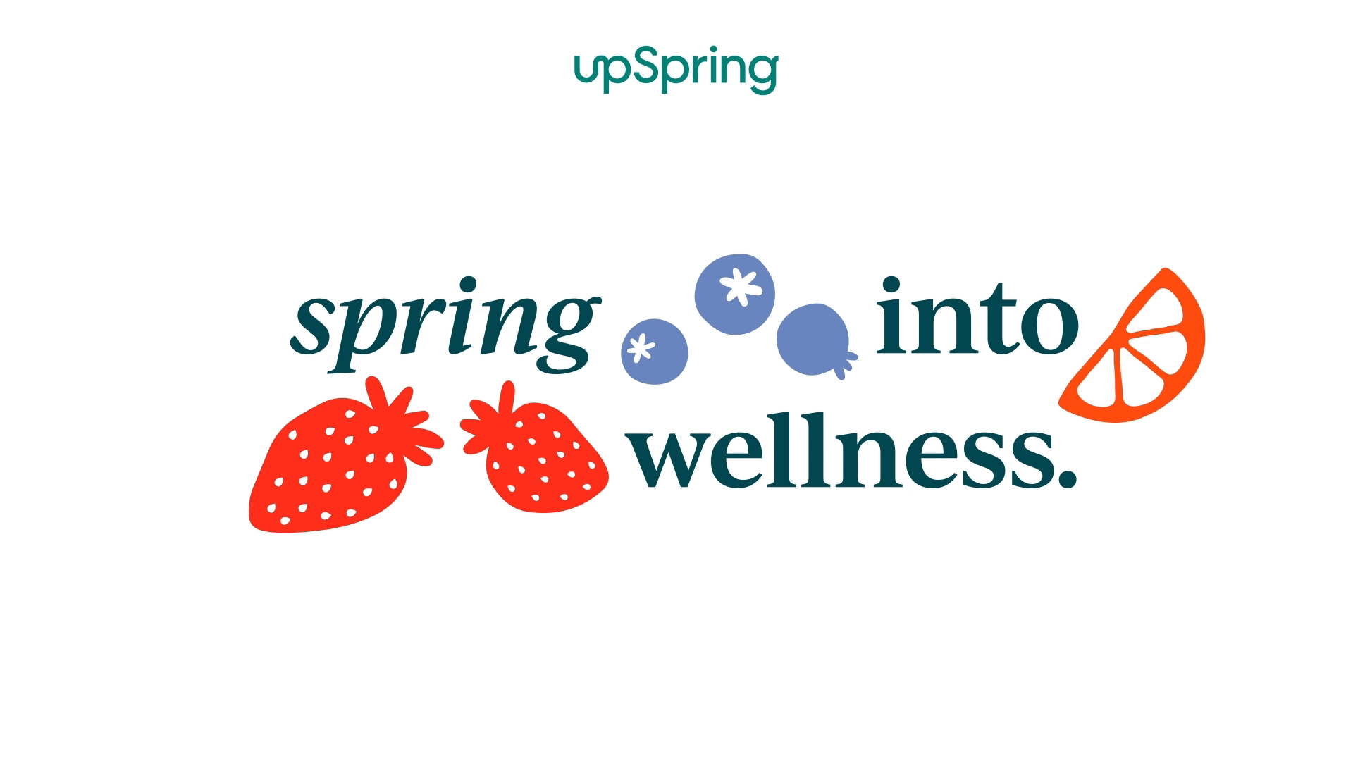
Rebranding isn’t just about changing how things look—it’s about transforming how they feel. For UpSpring, that meant embracing a sense of playful wellness and designing an experience that empowers women to take charge of their health with confidence and joy. Every element of the new identity was crafted to inspire, uplift, and energize.
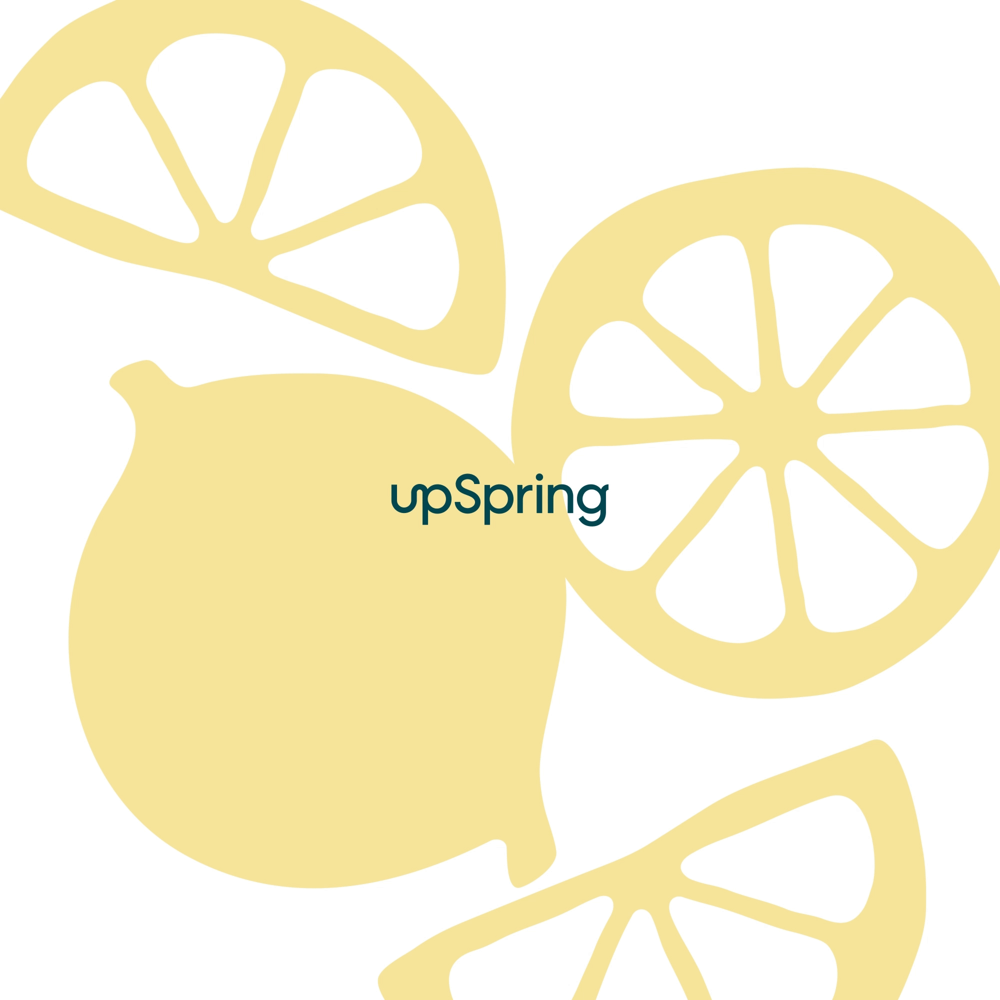
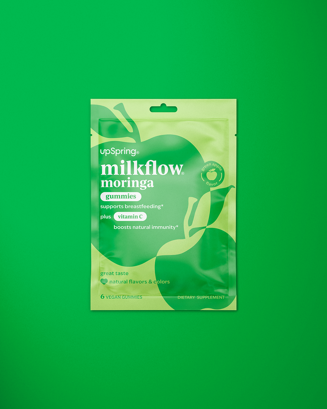
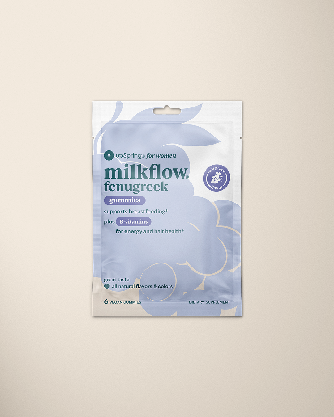
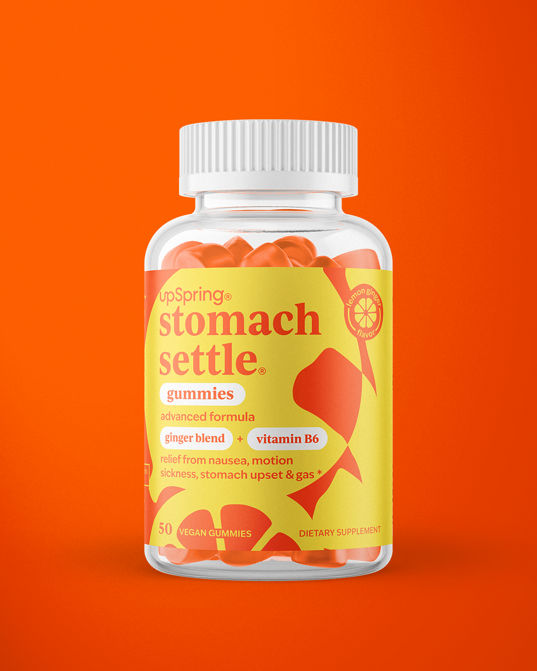
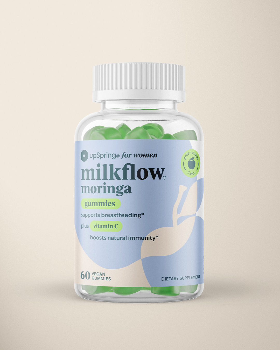
We infused the brand with warm, dynamic hues, modern yet feminine typography, and a voice that’s both authentic and empowering. Each product now tells its own story through a bright, monochromatic color palette and hand-drawn organic illustrations—celebrating the natural ingredients and benefits of every formulation. This fresh, expressive design language not only enhances shelf presence but also makes UpSpring’s wellness solutions feel approachable, exciting, and undeniably fun. More than a rebrand, this is a bold new chapter—one that invites women into a world of wellness that is vibrant, relatable, and made just for them.


The Outcome.
This rebrand goes beyond a visual refresh; it celebrates every woman’s journey. The revitalized identity enhances shelf presence, builds trust, and ensures that women feel represented and empowered through every detail.
The result reflects a brand experience that sparks joy, inspires decisions, and connects women to the wellness solutions they deserve—boldly stepping into a bright new era for the next generation.